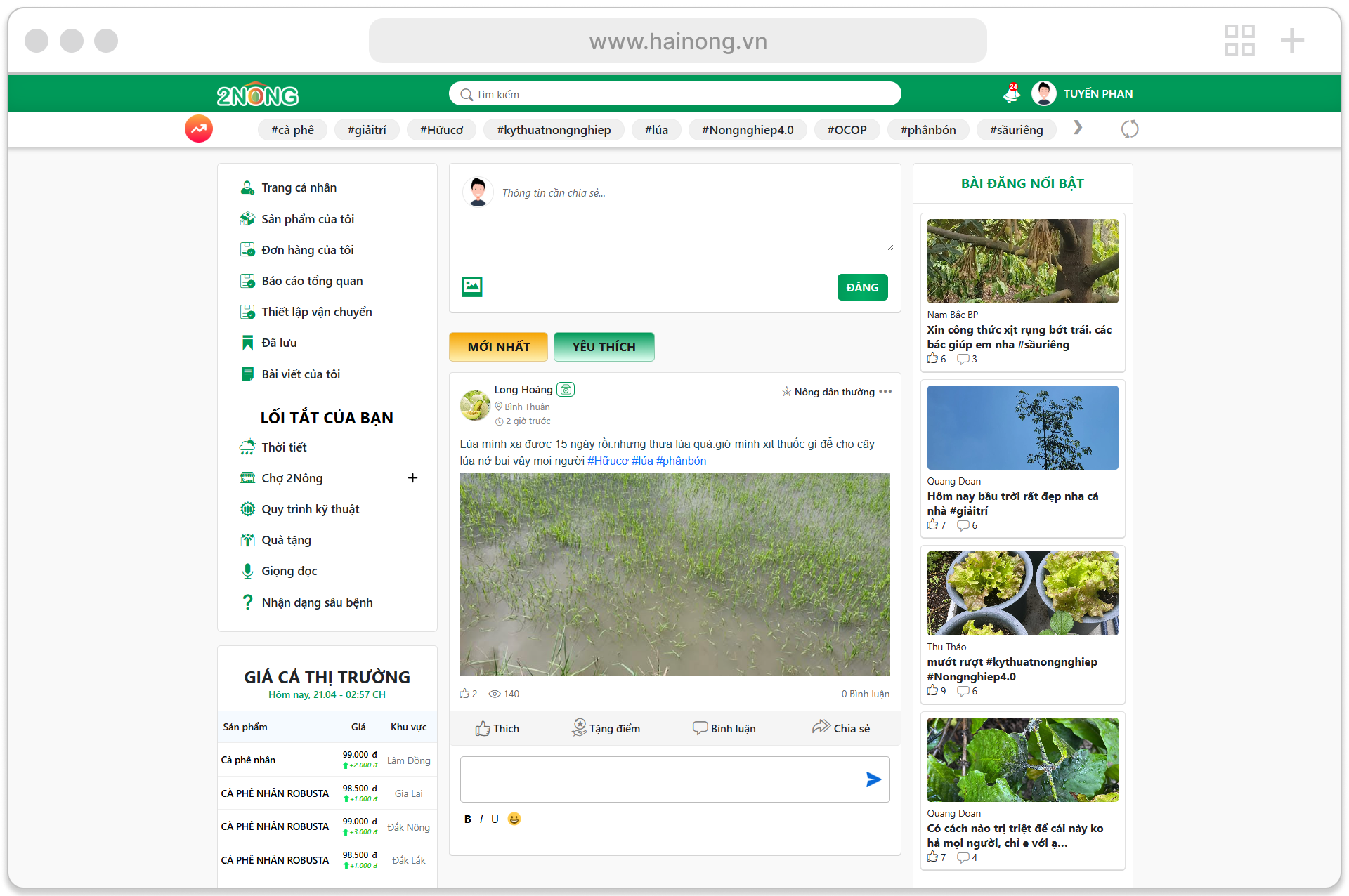
2Nong – Social Farming Ecosystem
Sep 2025
2Nong connects farmers, experts, and agricultural businesses enabling users to move seamlessly from problem discovery to solution and action within a single platform.
As a Lead Product Designer & Markup Engineer, I led the design and implementation of a scalable ecosystem that bridges community interaction, AI-powered tools, and commerce experiences.
My Contribution
- Product Design
- Component library for App + Website
- Documentation & usage guidelines
- Design-to-dev handoff and implementation alignment
Tools Used
- Figma
- Cursor
- Adobe Creative Cloud
- Design handoff specs
Overview
2Nong is a social farming ecosystem designed to support farmers through knowledge sharing, expert-driven community, and real-time agricultural insights.
The goal is to enable farmers to move from problem identification to actionable solutions seamlessly.

Ecosystem Vision
- Community-driven knowledge sharing
- Expert support for real farming problems
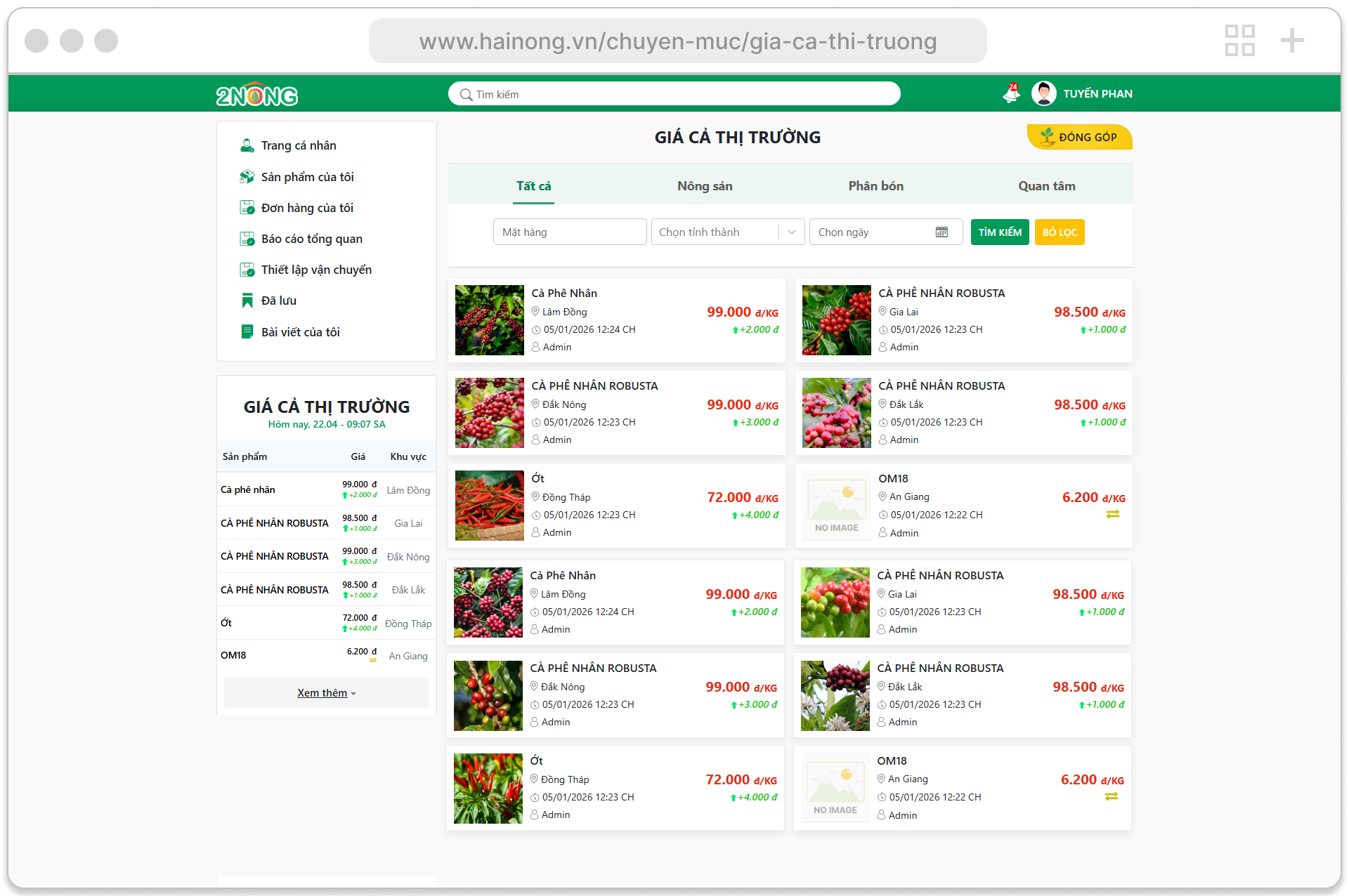
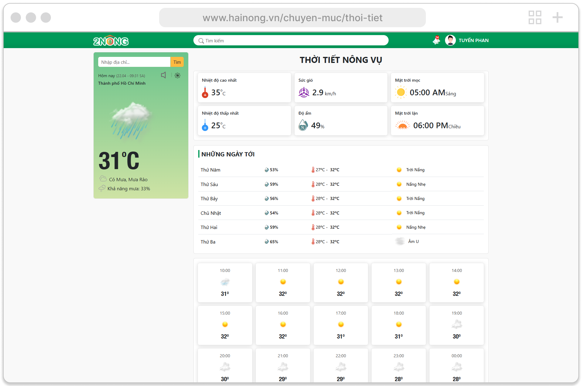
- AI-powered crop diagnosis
- Real-time market insights & pricing
- End-to-end journey from problem → solution → action
Problem
Knowledge is fragmented across multiple sources
Farmers lack access to trusted experts
No centralized platform for learning and action
Low digital literacy creates usability barriers
Farmers don’t just need answers—they need guidance they can trust and act on immediately.
Solution
We designed an integrated ecosystem that combines community, AI, and market data into a unified experience.
- Ask & share knowledge within community
- Use AI to detect crop diseases instantly
- Access expert-backed recommendations
- Check real-time market prices
Design Approach
The design approach focused on building a scalable and user-centered ecosystem balancing simplicity, consistency, and long-term growth.
Unified System
Consistent design system across App and Website
Guided Experience
Simplified complex flows into step-by-step interactions
Visual-first UI
Designed for low-tech users with clear and intuitive visuals
Scalable Architecture
Built to support a multi-product ecosystem and future expansion
Design to Implementation
Bridged design and development by translating design systems into scalable front-end architecture—ensuring consistency, efficiency, and seamless execution across the product.
Tech Stack
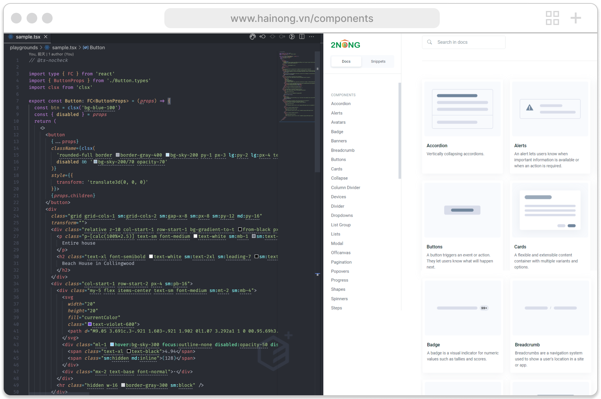
Component System
Developed a reusable, component-driven system to ensure scalability and consistency.
Design Tokens
Mapped design tokens to UI components for consistent styling across interfaces.
Ownership
Owned front-end implementation to reduce design–engineering gaps.
Efficiency
Accelerated development and improved maintainability through reusable patterns.
Design
Translated design specifications into reusable markup components, maintaining pixel-level accuracy and ensuring consistency across different product surfaces.
Implementation
Implemented design systems into scalable markup using ReactJS, NextJS, Bootstrap 5, and Tailwind CSS leveraging AI assisted tools to accelerate development, improve code quality, and ensure consistency between design and production.
Impact
The final product delivered measurable improvements in speed, accuracy, and user confidence helping farmers make faster and more informed decisions.
40%
Faster UI development through reusable components across App + Website
60%
Improved UI consistency using a unified design system and markup structure
80%
Reduced design–development gaps through direct implementation and alignment
Reflection
The final product delivered measurable improvements across the ecosystem helping farmers access knowledge, connect with the community, and make faster, more informed decisions.
Designing 2Nong was not about building a single product but about shaping an ecosystem.
Other Project
SIHospital
Hospital Website
A healthcare website experience designed to help patients explore services, find information, and connect with hospital care more easily.